Graphic Design Communicate in your brand visual voice
Customer Journey & Touchpoints Visualization
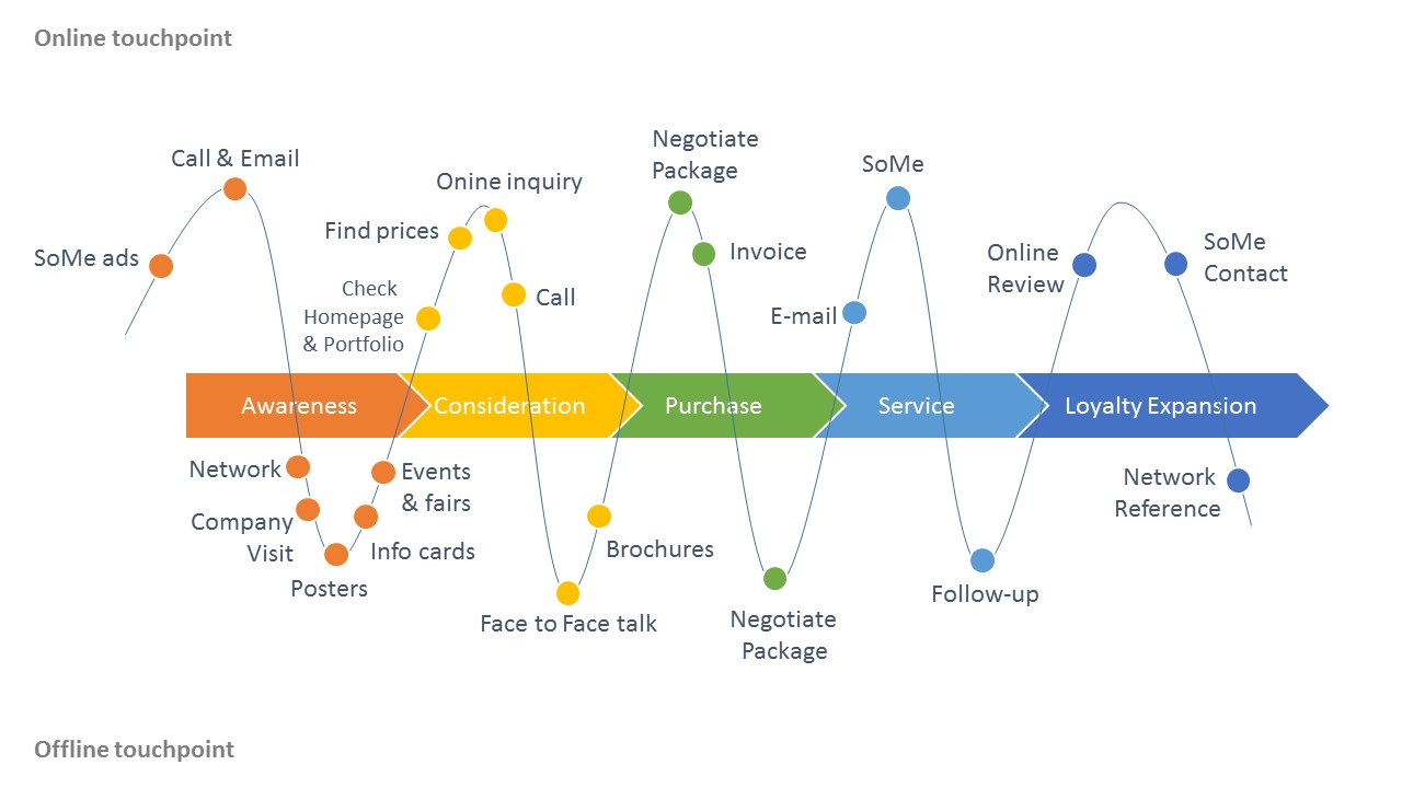
This is a customer touch-points visualization I created during entrepreneur course. From left to the right, is a timeline of a customer journey, from the customer has awareness of the business, to consideration, then make the purchase, use the service, and hopefully follows with a loyalty expansion phase. By visualizing the online and off-line touch points of the business, we can have a better idea of how to approach potential clients.
Social Media Lead Generation PDF content preview design
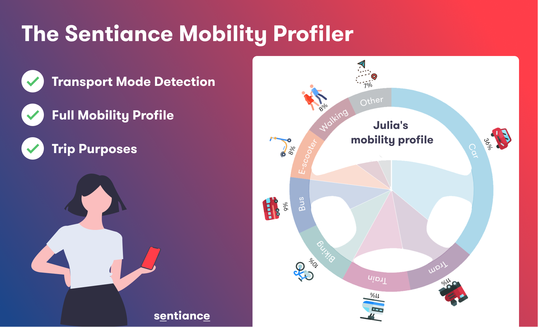
This is a PDF download preview I created for a LinkedIn marketing campaign. In this preview, 3 bullet points and a simple visual is used to explain what can the mobility profiler do.
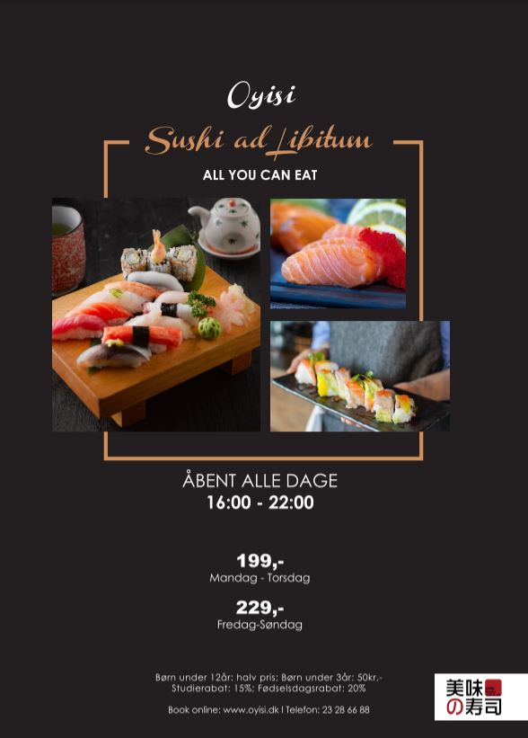
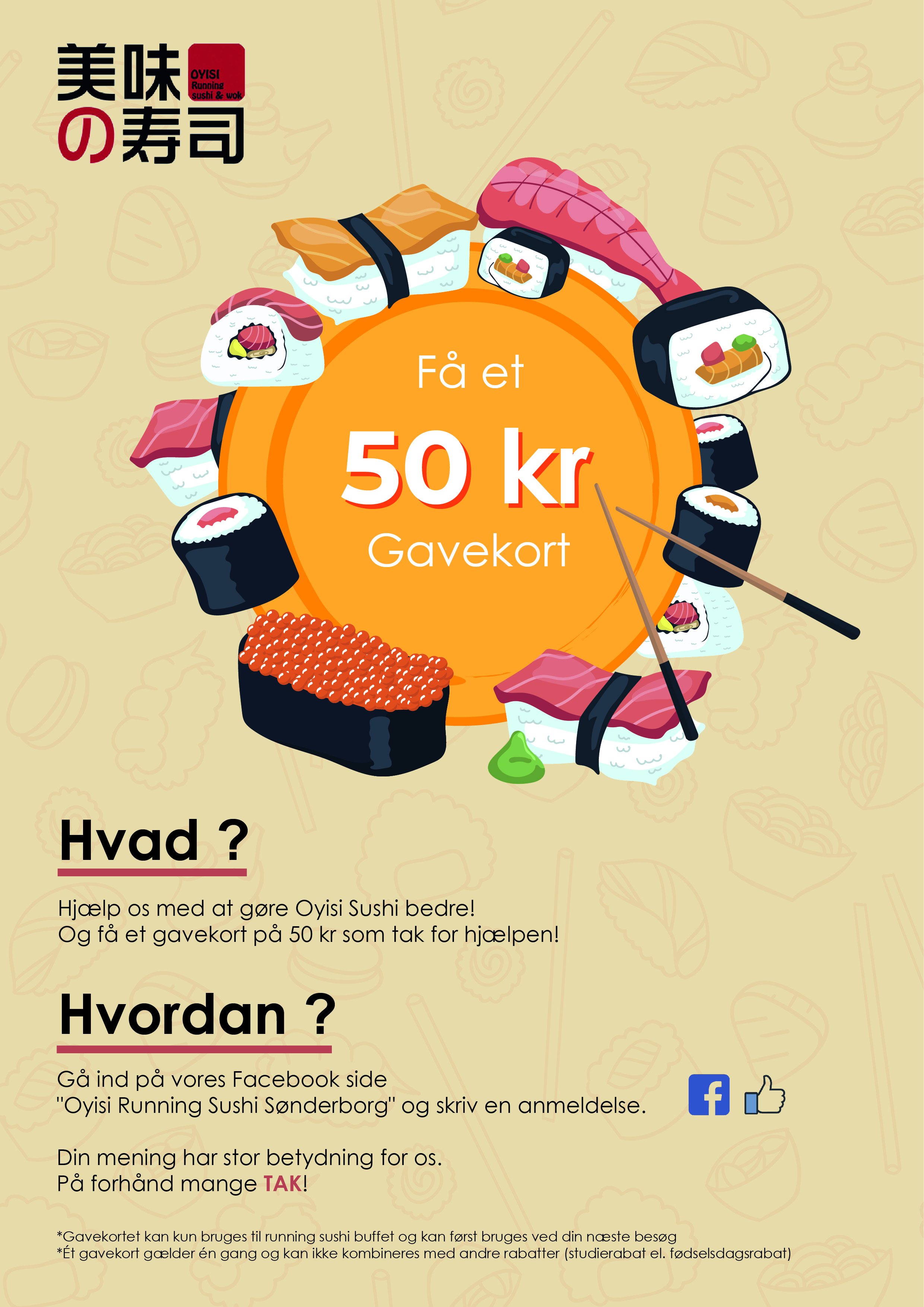
Sushi Restaurant Poster Design
On the left, it is a danish sushi restaurant poster that they put in front of the restaurant to attract customers, and present basic information. On the right, it is a poster shown at the cashier to encourage customers to engage in social media platform, and in return get a gift card from the sushi shop.
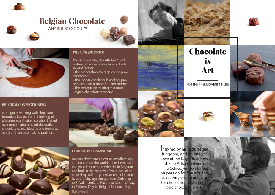
Product Brochure Design
This is a marketing material for a Belgium chocolate maker. This brochure tells about the unique story of Belgium chocolates, and helps customers to understand the Belgium chocolate culture.

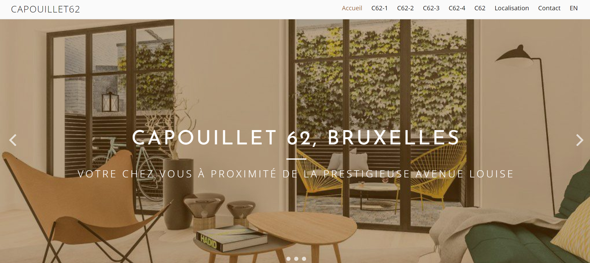
Real Estate Brochure Design
Luxury Home in Europe is a Belgium high end real estate company.
For the international luxury property show (LSP 2018) in Beijing, I designed the commercial folder, and postcards for each property. Besides, I redesigned their business cards for Chinese market use, with a PDF QR code, and visual icons.


Blog Infographic Design
“Her infographics have often been the talk of the office as they received more social interactions than many of the lengthy articles we published in the blog. I would often give her a loose concept and few links to work with, then a week or so later I would have the first iteration of work back. Her lightening fast responses and flexibility to feedback made her very easy to work with. She’s a doer with flair for creativity in her work.”
— Taylor Ryan

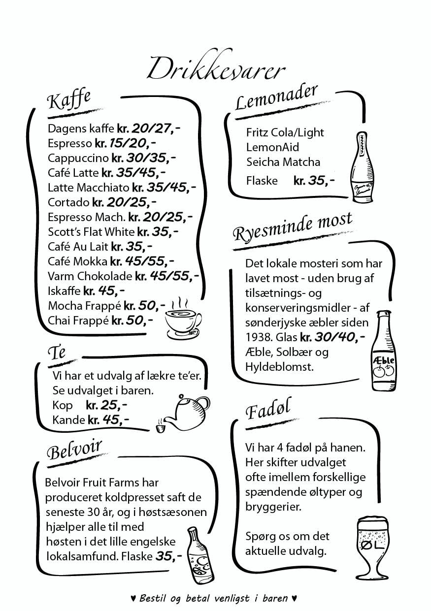

Cafe Menu Design
This menu is designed for a Danish cafe in southern Denmark. It is designed to be in a more visual and neat way, the sketching style also fits the cafe interior atmosphere. Menu, as a silent communicator, plays an important role in creating pleasant customer experiences.
LOGO Design Your brand visual presence
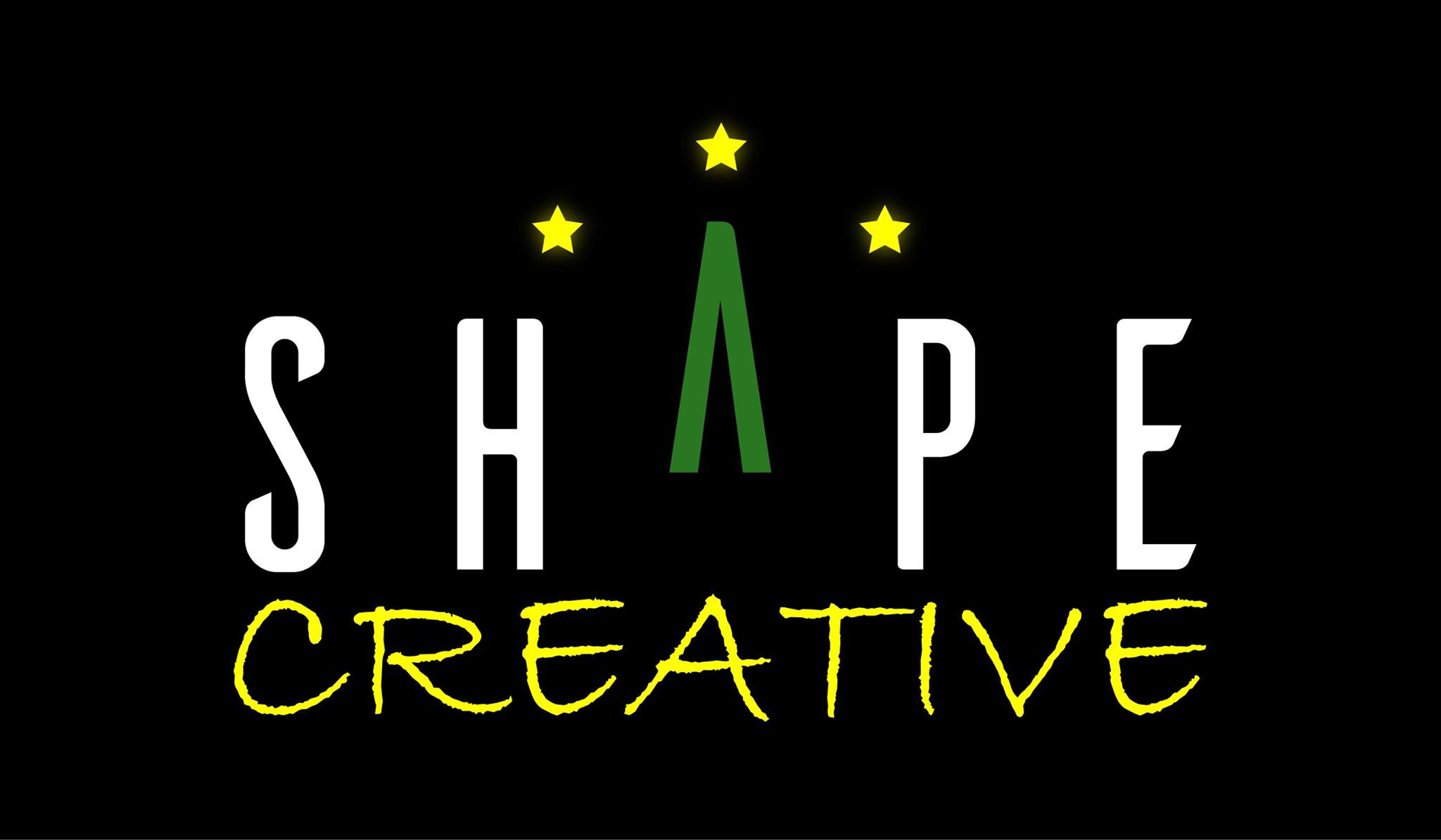
Shape Creative LOGO, Christmas LOGO.
Shape Creative is my one-man company in Denmark. The formal font of “SHAPE” stands for reliability, the hand-writing font “CREATIVE” stands for flexibility and creativity. The jump up “A” shows energy, and the three dots on the top means ideas and inspirations.

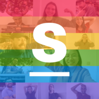
Employee care program LOGO, Pride LOGO.
An employee care program LOGO is created by adding a simple twist from the original LOGO. For the Pride LOGO, the people in the rainbow background stand for the celebration of diversity.
LOGO Design for City Foods Nordic ApS
City Foods Nordic is a B2B food supply company located on Sæjlland, Denmark, with a focus on seafood.
The sea wave is used as a reflection of seafood, but not strictly limited to seafood.
The circle around CF, symbolize the sun, together with the sea, create an image of fisherman fishing at sun rise.
The style is in a sharp, simple and neat Nordic style.
LOGO Development

LOGO & Business Card Design for Soof Finds
Soof Finds is a one-man start up company who offers Search Engine Optimization (SEO) service based in Vejle, Denmark.
The shape of magnifier conveys a message of “search” and “visible”.
The big “S” both stands for SEO, and the first letter of the owner’s name Sofie.
The style is efficient, fresh, clean and modern.
“Great service! I’m very happy with the logo design and marketing materials for my business. Jenny was able to visualize my thoughts very well in an efficient way so we came to a final design quickly. The result really fits my personal taste and matches the appearance I want to demonstrate with my business.”
— Sofie Veeger
Web Design Modern, Simple, Responsive
Real Estate Website Design
This is a multi-language (French & English) website made in WordPress for a high end real estate company.
TopChef2Go One-Page Website Design
This is a modern and simple one page website design, where different parts of the menu refers to different part of the page.
Illustration Visual story telling
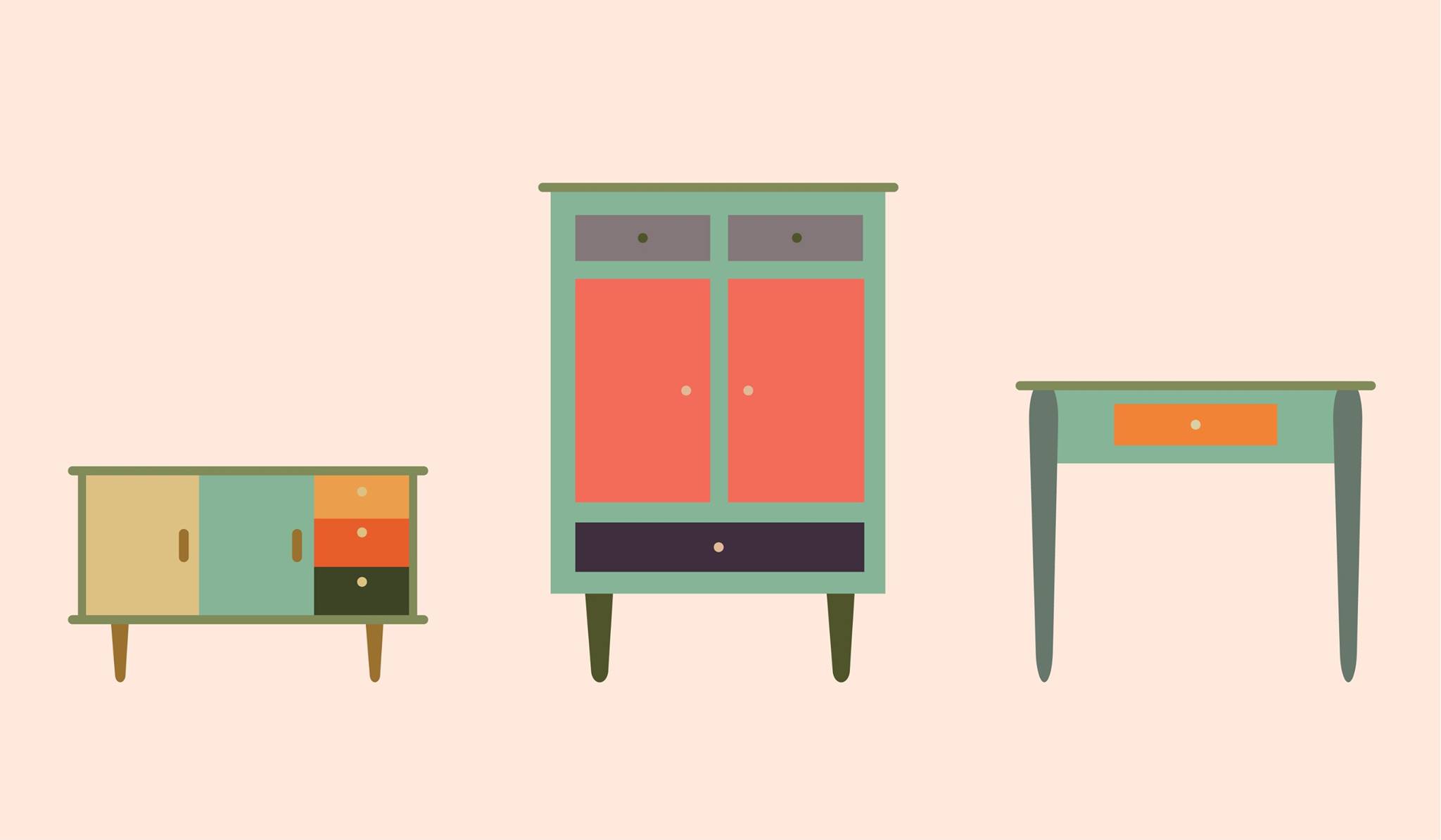

Vintage Illustrations
These are illustrations in vintage shape and colors, they are made for a second hand market poster. The bicycle has tall wheels, while the wheel shape tells that it can not really go fast.
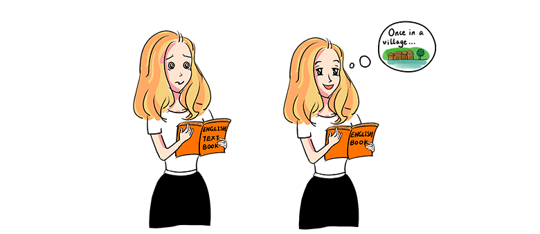
Hand-draw Illustrations
This is a set of illustrations done for an English teacher, who wants to illustrate the frustration when you do not understand English, and the joy when you are able to understand English language.
Illustration is a creative way to engage audience and show people benefits and stories vividly.
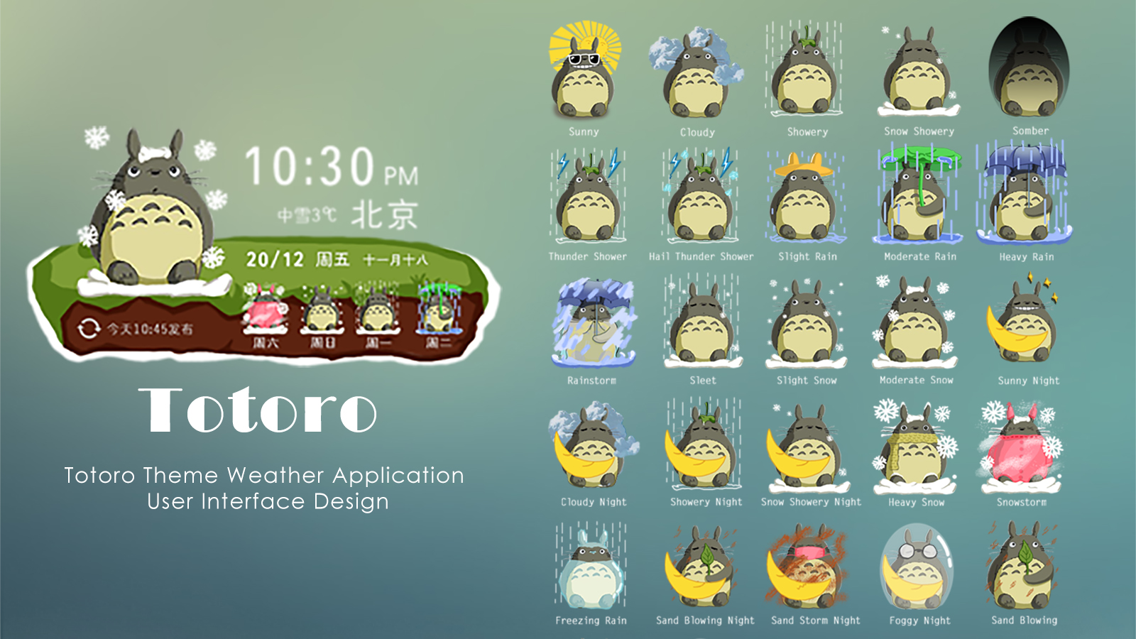
Weather UI Design
This is a creative Totoro theme weather application UI Design. The drawings are based on a famous Japanese cartoon character Totoro. Each weather has reflect on how Totoro react and look like under that condition. I enjoyed the creative thinking and visualization part a lot. It was done for a Chinese online design competition during my study.
Event Photography Capture the moments

Short Videos Engaging content for your audience
Earlier Works Product Design, Visual Merchandising, Graphics


